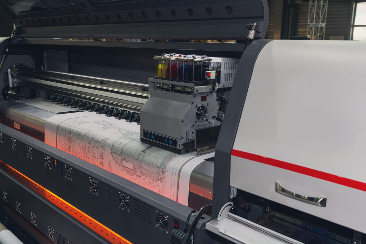
When creating large-scale prints and graphics, it is important to take into consideration how people will be viewing the final product. Unlike small-scale prints and digital designs, large-scale prints are typically viewed both up-close and far away and can be printed on various materials. Sometimes different file types, photo settings, colors, fonts and design elements don’t work well at both distances or on certain fabrics.
Below are our recommendations to achieve the large format print you envision without risking expensive mistakes.
File Types
While it is possible to produce large format designs with Photoshop and InDesign, the best file type for these types of prints is the vector file, or .EPS, created using Illustrator. Unlike other files types (JPG, PNG, BMP, INDD), vector files can be scaled up or down while remaining sharp. Otherwise, images and graphics can quickly become pixelated if resized and scaled too far.
If you can’t create your design with vector files, at the very least keep in mind ppi settings to avoid pixelation where possible. A lower ppi may be okay for signs and other print jobs that will be viewed from longer distances (over 10 feet). However, we recommend keeping ppi between 100 and 300 to be safe at various distances.
Photos
If using a photo in a large-scale print, you must first make sure your camera is set to the largest image size and the highest resolution. Additionally, make sure that the photos are shot in RAW format rather than JPEG.
Colors
For large-print materials, visibility can be difficult if colors do not contrast enough. Make sure your background color is not overwhelming your text or graphics. Everything needs to be easily readable and understood both up close and far away. Highly contrasting colors like black and white or navy blue and silver create distinct elements.
For banners and signs where your primary goal is alerting people from longer distances, keep your color scheme simple. Max out at two or three colors to keep it as readable as possible from far away.
Fonts
If you know your print is going to be large and may be viewed from far away, easy-to-read fonts are ideal. Characters should be kept to a minimum. Also, carefully spaced out text goes a long way in ensuring readability.
Sans serif fonts with enough space between letters and intermediate line thickness are ideal for large format printing. These include the classics like Times New Roman, Arial, Veranda, and Georgia.
Designs
You’ll want to create designs with the ultimate size of your product in mind. If designing for large-scale prints, small details can be missed, so you’ll want to keep elements bold, distinct and contrasting to be readable from longer distances. Simplicity in design can often add to the impact of a large-scale sign by focusing on the important message without getting lost in the details.
Test
Because large format print jobs are typically costly, we always recommend testing first. This is not usually possible in the ultimate large-scale size you’ll be printing, but if you scale a test accurately, you can print a small-scale example to make sure all of the elements are correct and aligned properly. Check visibility from different distances, make sure colors contrast well, check that messaging is clear and visible, and that the text stands out enough to be read. You can also test readability on your computer prior to printing just by viewing your design from longer distances.
Jack Rabbit Signs Can Create Your Large Format Sign
At Jack Rabbit Signs we do all kinds of sign printing, including large format printing. We make sure that your signs are legible, stylish, and impactful and can help you create a design that meets all of these criteria and more. For more information, give us a call at 919-571-1185.

